Project Overview
When I joined the design team, the existing UI library was inconsistent, with limited documentation and no cross-team adoption. Because there was no single source of truth, our dev team was creating new code for all new designs.
Challenges
Outdated UI Across Platform
The product had lots of UI inconsistencies and bad UX practices, which was causing frustration for our users.
No Single Source of Truth
Our dev team was building bespoke components for each new feature which was time consuming to build and review.
Inconsistent Implementation
There were hundreds of instances of "one-off" components, which meant the UI did not feel consistent.
No System for Scalability
The platform could not grow new features quickly because it was too time consuming to design and build.
Impact & Outcomes
~30% Faster Design Team Output
Faster design output due to the introduction of predefined, reusable components. We could produce fidelity designs and prototypes more quickly; meaning we could ship more features in the same amount of time.
100% Adoption Of Code Base Library
We collaborated with our dev team to build a code based version of our UI library. This improved alignment between teams, resulting in more accurate outputs.
~50% Time Saved Reviewing Coded Designs
Pre-approved components meant more consistent output, and fewer change requests.
Improved User Satisfaction
Users reported that their experience using the platform had improved significantly since changes were made.
Increase Scalability of Platform UI
The new UI library has enabled us to grow a wider range of components more quickly, whilst remaining cohesive.
User Feedback
“Recent updates have made the user experience much more straightforward and intuitive. The overall platform is perfect for our needs.”
- Verified User in Financial Services (via G2)
“An intuitive and user friendly platform”
- Verified User in Financial Services (via G2)
Opportunities
Increased Feature Output
Act as a single source of truth for design and dev teams; helping to align on functionality and structure.
Long-term Scalability
Accelerate the production process with reusable, standardised components.
Consistent Visual Language
Create a unified user experience across the platform, and reduce costly and time consuming rework.
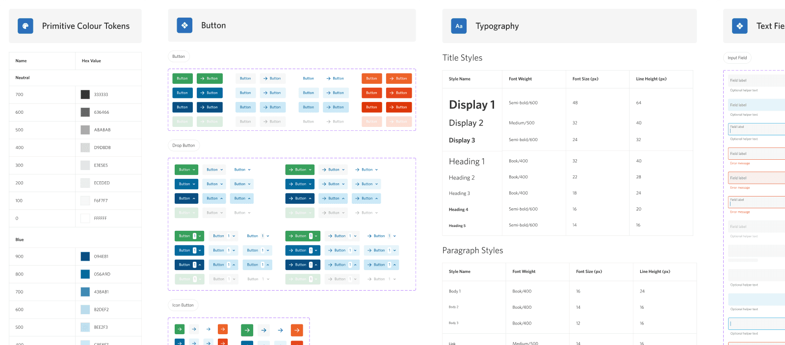
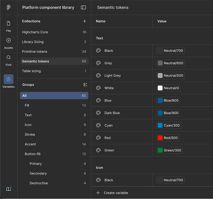
Consistent Visual Language
Variables were established in order to assign basic values like colour and space to specific usages such as background fills, or hover states.
This allowed us to build visually consistent UI and patterns.
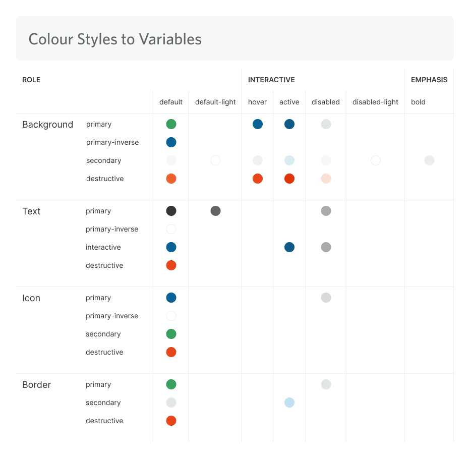
Components Properties
Component based properties allowed us to build a wide range of interaction states.
This allowed us to create realistic wireframes and prototypes for a wide range of use cases.

Non-disruptive Overhaul of UI
We could not build a whole new library from scratch, as users were accustomed to many aspects. Instead, we compromised by keeping certain elements, and built a modernised library around them.
A modernised UI style helped to limit disruption for existing users when modernising the platform.
Clarity & Speed
Components were configured to be intuitive, lean, and part of a unified system.
These settings helped to provide predictability, and allowed us to create high quality designs faster.

Long Term Scalability Focussed
Simple components like buttons were nested within more complex components such as modals.
This helped the UI library to scale, built familiar patterns for users, and saved us hours of time tweaking small values.

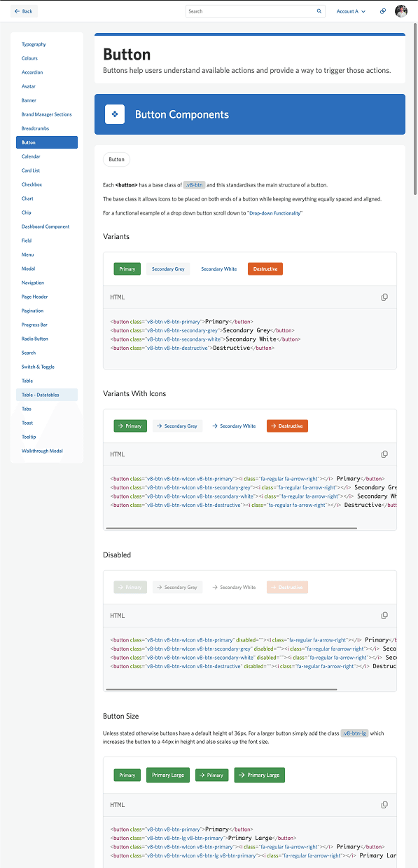
Code Based Version
We worked with the development team to build a code based version of the UI library, which matched both visually and for interactions.
This significantly impacted the visual consistency of newly developed features, and meant less time was spent manually coding new UI.

Code-Based UI Library

