Project Overview
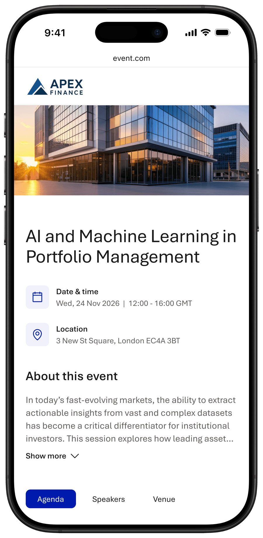
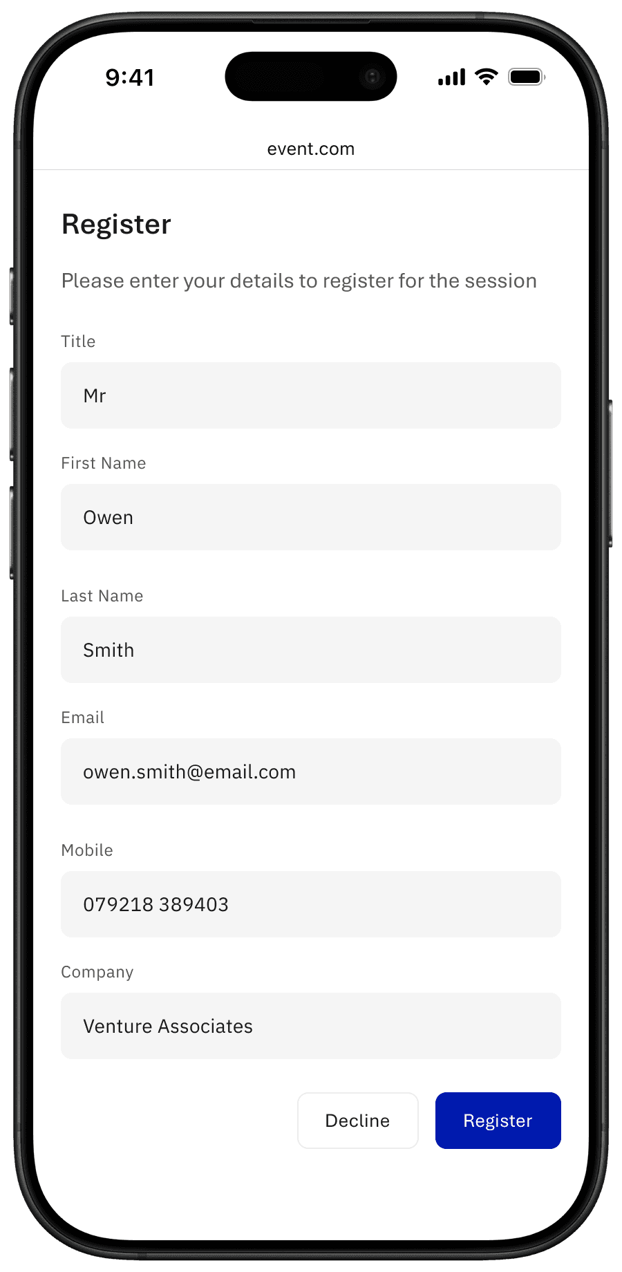
StoneShot provides a customisable event registration page that finance companies used to invite leads to upcoming events.
The page included key details such as the overview, date and time, location, speakers, agenda, and imagery, and allowed attendees to select their preferred event when multiple locations were offered. Recipients could register or decline via a shared link.
Challenges
Outdated User Experience
An unpolished experience damaged brand perception and reduced attendee sign-ups.
Unclear Event Information
Confusion reduced conversion rates and increased drop-offs during registration.
Limited Brand Customisation
Pages felt generic and misaligned with company branding, weakening credibility.
Impact & Outcomes
Successful Event Sign-ups for Hundreds of Guests
Optimised the registration experience to reduce drop-offs and boost attendance, driving greater lead engagement and revenue potential.
Strengthened brand trust at the first touchpoint
Delivered deeper visual customisation, enabling fully on-brand registration pages that created a more professional and credible first impression.
Improved event conversion rates
Redesigned the registration journey to clearly and intuitively communicate event details, reducing confusion and increasing sign-ups.
Opportunities
Increase Event Sign-Ups
Redesign the registration experience to communicate event details clearly and intuitively, reducing confusion and improving sign-up rates.
Build Trust Early
Enable deeper visual customisation so registration pages fully align with each company’s branding, creating a more professional and credible first impression.
Drive Higher Event ROI
Optimise the registration solution to reduce drop-offs and increase attendance, maximising lead engagement and revenue potential from hosted events.
User Feedback
“Recent updates have made the user experience much more straightforward and intuitive. The overall platform is perfect for our needs.” — Verified User in Financial Services (via G2)
“An intuitive and user friendly platform” — Verified User in Financial Services (via G2)


Research Insights
Insight 1
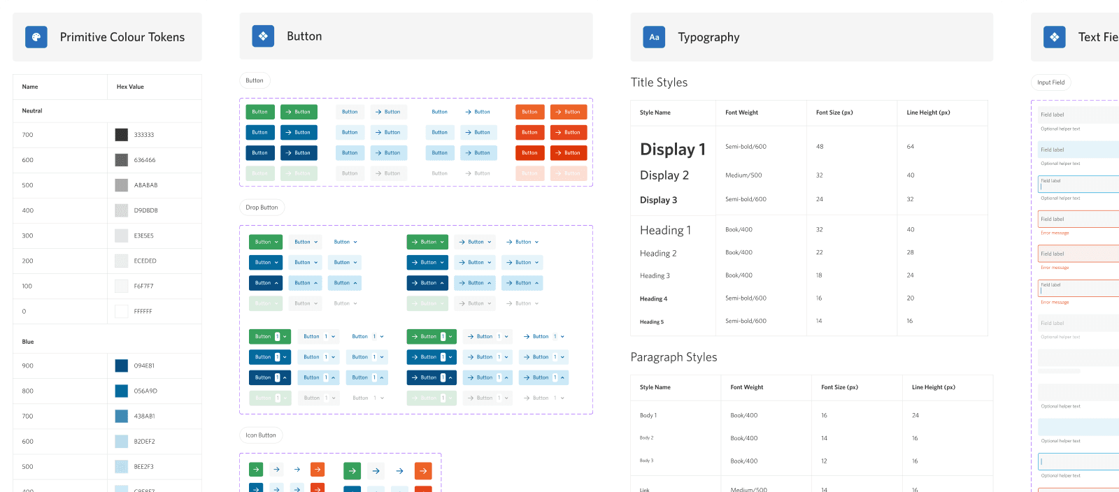
Users associated the visual quality of the registration form with the credibility of the event itself. Outdated UI patterns reduced confidence before users had engaged with the content.
Design Response
I refreshed the visual hierarchy, spacing, and typography to create a more modern, polished experience that aligned with competitor expectations.
Insight 2
Customers needed to communicate different types of information depending on the event. These included agendas, speaker bios, locations, or virtual access details.
Design Response
I designed modular content sections that could be toggled on or off, allowing customers to tailor the registration page to each event without breaking the core structure.
Insight 3
Customers wanted their registration pages to reflect their brand through colours, banners, and calls to action, but the template offered limited flexibility.
Design Response
I designed configurable branding elements, including banners, colour accents, and branded CTAs, which could be set in the main platform, and helped to reflect brand identity.